 There’s plenty of room for alternative (and flexible) views of investment markets, says Ron Bewley.
With the S&P/ASX 200 Index having been range-bound from August 2009 to the time of writing (early May) there has been lots of talk of resistance and support levels – the stuff of technical analysts and their followers. I have never understood how algebraic manipulations can come up with a meaningful number when there are many inter-related indexes (ASX 20, ASX 100, ASX 300, et cetera), hundreds of stocks and many, many buyers and sellers – some of whom do not believe in technical analysis.
An academic buddy of mine, Roy Bachelor, presented a paper a few years ago showing that there was no tendency for indexes or prices to hang around so-called resistance levels. Naturally he was treated as a heretic in the City of London. I do not subscribe to technical analysis either, but one of my measures for reading the market can be thought of as having evolving resistance and support levels.
My measure of mispricing – or market exuberance – is based on my analysis of broking analyst forecasts of, among other things, dividends for the top 200 stocks. After transforming these forecasts into capital gains forecasts for the index and its main sectors, I use them to try and measure exuberance. I do this using the assumption that these index forecasts on average are the best forecasts I can come up with.
Using the notion that deviations of the index from these forecast trends is a random – or mispricing – signal, I update a weighted average of the fit of these forecasts. The weights evolve over time depending on how well the forecasts are performing at the time. As a result, each day I have a new estimate of where the market should be and the departure of the index from that fundamental is my measure of mispricing.
‘Other methods I use to measure feat and disorder add a fourth dimension to the chart’
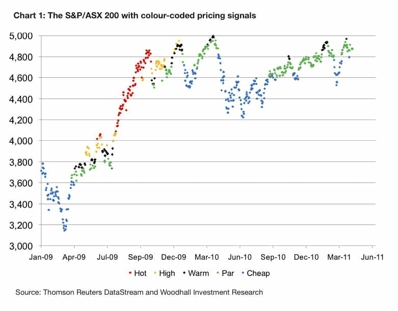
Rather than simply plotting the time series of exuberance, I prefer to look at a ‘three-dimensional’ chart of the index which is colour coded – as in the chart above. Instead of plotting the index as a line chart, as is usually done, I use a dot for each day and colour it according to its mispricing. Red is for over-heated days that are more likely to correct or, importantly, move sideways until the fundamental comes up to the index, hence eroding the mispricing. Blue is for cheap, and the intermediate colours signal par (green), and slight (black) and moderate (yellow) overpricing.
The chart starts at the beginning of 2009, although I have done the analysis going back to 2002. The chart is too busy when I start it earlier than 2009. Unsurprisingly, the chart is blue for cheap at the bottom of the market in early 2009. Importantly, other methods I use to measure fear and disorder add a fourth dimension to the chart.
 The first month or so of the recovery took the market into “green”, or fair-priced. A quick burst of black, yellow and then red coincided with a slight correction around June 2009. This was the normal behaviour before the GFC. After a dip in the index below 3800 and a cheap market (buying opportunity), the late 2009 bull run set off.
The market stayed red from just above 4000 to over 4800. This behaviour had never been detected before. There was no correction, but there was an extended period of sideways movement to erase the over-pricing as the fundamentals improved. That’s why I never use exuberance for trading. I use it to aid market entry and exit at “appropriate” times.
Since the start of 2010, the market has been well behaved again – at least by my measures. As it happens, my measures of fear and disorder also returned to normal (pre-GFC) levels at the start of 2010. What is important in following the colour coding during 2010-2011 is that the market didn’t go black, or warm, until nearly 5000 points in February 2010, and black was attained at three quite different and lower levels after that.
I now think of black as a sort of mild resistance level – and red a very strong, but moveable, resistance level. Support is a bit different, but blue has often presented some useful buying levels. I think the combination of exuberance, fear and disorder have worked well for me since I introduced the concepts in 2005. But like all investment research and ideas, there is plenty of room for alternative points of views.
Ron Bewley is executive director of Woodhall Investment Research – www.woodhall.com.au


Leave a Comment
You must be logged in to post a comment.