The US Federal Reserve’s fixation on inflation “stickiness” is founded on poor statistical analysis. It’s high time it started cutting rates back to the neutral rate of 3 per cent. Producer Price Index (PPI) inflation and wages reflecting input cost are under control, and inflation expectations are more than reasonable.
I have reasonable cause to state that the Fed seems to be waiting until inflation gets back to 2 per cent (maybe December 2024) before it starts easing. It might then take six months (or more) to complete the easing. Under my conjecture, that could mean it takes two and half years after inflation was (hypothetically) cured (end of 2022) before rates are normalised. And the contractionary effect of those interest rates could last another 12 to 18 months after the extra two and a half years.
If I had a role of any importance in the US bureaucracy, I would be encouraging the Bureau of Labor Statistics (BLS) to produce inflation data that are better suited to conducting monetary policy.
The Reserve Bank of Australia seems to be following the Fed – but its inflation data are tame – and there are sufficient macroeconomic data in Australia to call that it is already in recession. On top of the restrictive policy that the US faces, we also have a cohort of mortgage holders paying unnecessary excess repayments – if they can sustain the pressure.
The best time for the RBA to start cutting rates was last year. The next best time is on Tuesday 7 May. The Australian consumer has already experienced economic pain, increased mortgage repayments and depleted savings that could reasonably have been avoided.
How inflation signals are transmitted
Because of the importance of inflation in influencing monetary policy – not just in the US, but Australia as well – understanding how inflation signals are transmitted to central banks is fundamental to conducting smart policy.
At last, I’ve deconstructed US consumer price index (CPI) inflation to reveal where the problems in the calculations are lurking. Yes, there may still be minor inflationary effects (e.g. oil spikes) to come, but I am convinced that US CPI inflation has been beaten – but nobody (else) seems to know it.
The problem started with the pandemic and the consequent lockdowns and supply-chain disruptions. That was followed in short-order by the spillover of the Russian invasion of the Ukraine; shipping costs, oil and food prices skyrocketed.
Fed chair Jerome Powell, in his wisdom, said the inflation increase was transitory because, as the supply conditions eased, disinflation would start without rate hikes. Hiking rates does not help ease these supply conditions.
Then Powell got bullied and started to hike rates like they were going out of style. The Fed funds rate was hiked from a range of 0.0 per cent to 0.25 per cent to the current 5.25 per cent to 5.0 per cent. Of course, monetary policy tightening didn’t start until the Fed funds rate went above the neutral rate that divides accommodative from restrictive monetary policy – about 2.5 per cent to 3.0 per cent was the conventional wisdom. Some want to revise that estimate a little higher because of the recent resilience of the US economy.
The first recent hike from 0.0 per cent to 0.25 per cent in the US was made in March 2022, or two years after the World Health Organisation acknowledged the full severity of the pandemic – and only a couple of weeks after Russia’s invasion of the Ukraine.
After a few sharp hikes, the Fed funds rate was in contractionary territory from September 2022.
Since the 1960s (at least) monetary policy was thought to take a long time to pass through to the real economy. The evidence simply indicated that interest rate changes took 12 to 18 months to generate impact. I was taught that back in those days and I did not notice any challenges to that orthodoxy until after this round of tightening started.
The false signals lurking in the data
The Fed points out that it prefers the so-called “core” variants of inflation readings as they “strip out volatile elements like fuel and food”. At first, I was comfortable with that sentiment until I got into a detailed analysis of my own. I found that there is a far more important source of distortion in the aggregate CPI picture.
The BLS, which produces and publishes the US CPI data, also provides data on a lot of sub-indexes. Let me first focus on “shelter”, which is meant to represent rents, costs for owner-occupiers and a small component reflecting short-term living away from home to work.
Shelter comprises a massive 33 per cent of the CPI so it is worthy of anybody’s attention if they want to know the truth about inflation. Investigating the shelter index calculations shows that it lags the current rental market.
To estimate the owner-occupier component, the BLS turns to “similar’ properties that have a market rent attached to them and then impute the OER (owner equivalent rent). The shelter index is all but a rent index as the third component (living away) is tiny.
The BLS archived reports indicate that most rents are for a leasing period of 12 months or more and landlords are reluctant to increase the rent for a sitting tenant so the rent maybe static for an even longer time.
The BLS only samples the rent on a property every six months. If they do it in a reasonable fashion (and I have no reason to suspect anything else), this sampling only produces a little more sampling error but not another lag in the system.
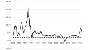
I show the history of the shelter inflation rate since 1968 in the next chart. I’ve also put the Fed’s target 2 per cent (for CPI inflation – including shelter) on the chart. It is obvious that shelter inflation has rarely been under target since 1968 so the CPI index less shelter must to do the hard work for CPI inflation to satisfy the Fed target.
If I go back to the original Fed scenario and imagine there was, indeed, an actual sharp, sudden spike in inflation for a short period – as seen in the dotted line on the graph below – we can see the impact of the way that the Fed gets inflation data.
Take shelter
What interests me is the impact the constant shelter rent of a home during its leasing period implies for the analysis. It’s not possible to work backwards to find out what was going on, so I’m taking a hypothetical case to gain insight into what might be going on. I’ve assumed that actual inflation of “spot” rent – not including the leasing element – as 2 per cent p.a. for all time except for each month of 2022 when it was 10 per cent p.a. I show that as the dotted black line in the ‘Stylised comparison’ chart.
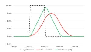
The red line is the observed (hypothetical) inflation using the BLS and Fed standard year on year (YoY) calculations. That is the Fed uses the current inflation number as the aggregate of each month’s inflation for the past year. So, any high inflation spike takes a full 12 months to work its way out of the figure. Moreover, the red line peaks well after the hypothetical inflation has returned to normal (2 per cent) because of the assumption of a constant rent during the lease agreement. Observed inflation does not reach the 10 per cent hypothetical peak for the same reason.
The fundamental point I am making here is that, because of the length of the lease agreement and the use of YoY calculations for inflation, a spike that ends in December 2022 takes until December 2024 before it no longer shows up in reported inflation.
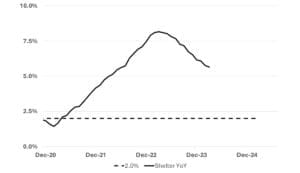
I see strong similarities between the hypothetical response (red line) and the actual YoY data in the chart above.
This comparison is not a mathematical proof but it convinced me that the shelter problem may have already gone away and it is a statistical artefact that gives shelter inflation the so-called stickiness.
In the stylised comparison chart, I also show inflation using an annualised measure based on quarter on quarter changes (QoQ) in green. Naturally the green line reacts more quickly but it still peaks after the problem has dissipated.
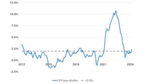
These results reinforce my wish to analyse the BLS index of CPI less shelter separately. In the next chart I show that even the YoY CPI-less-shelter inflation had a transitory peak. Powell was correct – he just didn’t hold his nerve and his analysts let him down.
It does not make a heap of sense to use a QoQ measure here as the BLS does not seasonally adjust these data and a QoQ measure would amplify the seasonal changes. But I can use it on the aggregate CPI data as the BLS does seasonally adjust these data.
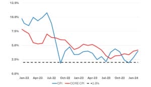
In the previous chart I show both headline and core (seasonally adjusted) inflation using a more appropriate QoQ analysis. It shows inflation has settled down – but the previous charts tell me, it has settled above 2 per cent because of the momentum in the calculations that have kept shelter inflation above 5 per cent even though the underlying rents have possibly returned to normal. Other data sources I have noted on news feeds support this view.
Australia has witnessed four consecutive quarters of negative per capita GDP economic growth; retail sales (adjusted for inflation) are down 2 per cent over the last 12 months – and that does not allow for the increase in population that has masked the poor health of the economy; and wages, adjusted for inflation are down around 7 per cent from the October 2022 peak.
Both the Fed and the RBA seem to be too concerned with adding to the backlash to their past poor commentary. Powell said the inflation surge was transitory and the former governor of the RBA, Phil Lowe, expected rates would not rise until 2024 at the earliest. Both were correct if they had only added a small proviso.
Powell could have been more explicit in how long a transitory period might last. Lowe could have added, ‘unless we experience a severe inflation shock generated from outside of our economy’.
I am yet to be convinced that high interest rates contributed much to the fall in inflation. The fall may have been largely due to the easing of supply problems. John Cochrane, Professor of Economics at Standford University, has publicly expressed this view at an RBA sponsored event.
Since we cannot turn back the clock and try alternative policies, we can never be certain about what may otherwise have happened. We can, however, easily improve our statistical representation of the inflation problem to allow central bankers to act in a more timely manner.
Australia does not publish a CPI less housing index so I created one as an approximation. Housing is about 22 per cent of the Australian CPI and, when it is removed, the Australian inflation problem goes away with it. Problem solved!
Ron Bewley is executive director of Woodhall Investment Research.





Leave a Comment
You must be logged in to post a comment.