Last month, I wrote about the optimal allocation of the ASX 200 and S&P 500 in a two-index portfolio. I found that a 57:43 balance, respectively, was consistent with my forecasts of total returns and volatilities. I now turn my attention to a direct equities portfolio across both the ASX 200 and the S&P 500. I apply the same methodology to the US market as I have previously reported here for an Australian portfolio.
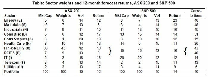
The table shows the market capitalisations of the component sectors. While the IT sector is only 2 per cent of our market, it is 26 per cent of the US market – its largest sector. In contrast, finance is our largest sector, at 42 per cent (Fin-x-REITs 35 per cent + REITs 7 per cent), while it is only 15 per cent of the US index.
Table: Sector weights and 12-month forecast returns, ASX 200 and S&P 500

Source: Woodhall Investment Research
Note: Correlations refer to the relationship between the monthly total returns for each pair of sectors in the two aggregate indices from April 2000 to March 2018. The US returns are converted to Australian dollars for this purpose. The letter in parentheses after the sector names is a commonly used abbreviation and F is the abbreviation for the combined Financials sector.
The expected 12-month returns – all based on Thomson-Reuters surveys of brokers’ forecasts for earnings and dividends processed in the same manner by Woodhall – are starkly different in certain cases.
When each portfolio is separately optimised under the same constraints – that is, the sector weights lie between 0.0 and 1.25 times market cap, my usual high-conviction constraints – the optimised weights are shown in the table. Only Materials (7 per cent) and Consumer Staples (1 per cent) are underweight in the Australian case (that is the optimised weight is less than the actual market cap weight). On the other hand, it is only Health Care (5 per cent) and IT (20 per cent) that are underweight in the US case.
The aggregate forecast returns for the broader indices are given in the last row of the table. Australian portfolio total return is expected to be 12 per cent, while the forecast return for the US is 14 per cent.
When volatility is taken into account, both portfolios produce Sharpe ratios (or risk-adjusted returns) of 1.1.
The final column of the table shows the correlation between the returns in corresponding sectors of the two markets. Four sectors stand out as having particularly low correlations: Consumer Staples (15 per cent), IT (14 per cent), Telecom (13 per cent) and Utilities (6 per cent).
There are possible diversification benefits that could be gained from optimising a joint ‘21-sector’ portfolio that considers the same sector name in the two markets separate sectors. Since the market capitalisations of the US sectors completely dominate those in Australia, the upper constraints on the portfolio weights discussed above make no sense to impose without modification.
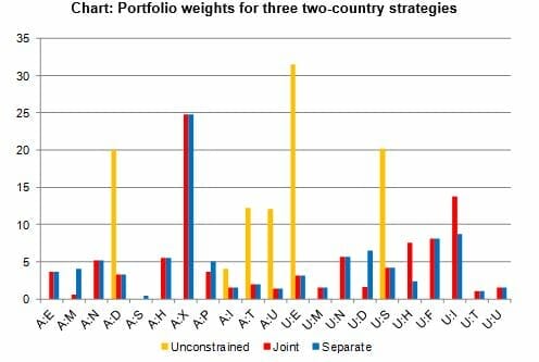
In the first instance, I consider only the non-negativity constraint (no shorting) with an unconstrained upper limit. The optimised weights are shown in yellow in the chart. Only six sectors have non-zero weights and no sector gets a non-zero weight in both markets. The sum of the weights for the Australian sectors is 48 per cent, which is not far from the 57 per cent reported in the previous issue for the benchmark indices in a slightly different time period.
Chart: Portfolio weights for three two-country strategies

Source: Woodhall Investment Research
Note: The prefix A denotes Australia and U the US.
In a second experiment, upper constraints (less than 1.25 times market cap) on the optimised weights were imposed, subject to a 57 per cent total weight for the Australian sectors. These (joint) weights are shown in red. The two (separate) sets of weights are shown in blue – again using the 57 per cent weighting rule. The red and blue weights are the same when the optimised weights lie on the upper bound. Important differences emerge between the red and blue when adopting a joint optimisation strategy. In particular, the Australian Materials weight is reduced almost to zero and the US Consumer Discretionary is cut sharply, while US Health Care and US IT are increased (they were both underweight in the single-market portfolio).
For the combined unconstrained portfolio, the expected return/volatility is 17.2%/7.4% for a Sharpe ratio above 2, compared with 1.1 for the single-market portfolios!
The take-away from this experiment seems clear. The unconstrained portfolio provides good coverage of six different sectors. It reduces the expected volatility by more than 2 percentage points over the single-market portfolios in the table. The expected return is an impressive 3 percentage points higher than the better single-market portfolio. Further testing is warranted to establish the properties and performance of this unconstrained portfolio before it becomes a valid investment option but the prospects seem promising. The sector weights do need to be populated by appropriate stocks, as in my Australian portfolios, but that exercise is relatively straightforward.


Leave a Comment
You must be logged in to post a comment.