
Benchmark-hugging strategies have endured significant outflows of funds in recent years and this outflow has generally gone into two different options – index funds and highly active strategies.
Index funds have been chosen because of their low cost and the perceived performance failure by the benchmark huggers, whilst the trend towards highly active strategies is about providing greater scope and flexibility away from the benchmark to increase chances of adding meaningful value.
Highly active strategies may be defined in numerous ways and can include concentrated, small-cap portfolios, long/short and maybe variable beta strategies. Supporting this move towards highly active strategies has been various pieces of literature showing that high ‘active share’ strategies (i.e., an active share > 80 per cent) have a tendency to outperform peers and relevant benchmarks. Active share is a measure of difference to the benchmark, and is based on actual portfolio holdings compared with the benchmark holdings.
Unfortunately, capturing active share on an ongoing basis across a universe of hundreds of strategies is not easy. Unless strategies are prepared to provide ongoing security holdings, it is difficult to keep track of active share, so monitoring a strategy on this basis is pretty much impossible. The next best step is to monitor variability to benchmark using measures such as tracking error or non-market risk, as per the Capital Asset Pricing Model (CAPM, which is a performance-based market risk-adjusted form of tracking error). As long as historic performance is provided, both of these measures can provide a decent historical understanding of how much a strategy’s portfolio varies from a chosen benchmark.
Whilst the outcome of choosing index funds should be quite obvious – index performance minus fees – there is limited information in Australia on the success of highly active Australian equities strategies or of those with high levels of non-market risk. The purpose of this article is to provide a simple insight into the performance persistence of high non-market risk Australian equity strategies over the last 10 years.
Source: All charts and tables via Delta Research & Advisory
Methodology
There are numerous biases in pretty much all investment datasets available. It is worth noting that the one bias that is rarely removed, and this article is no exception, is the bias of survivorship. So, whilst every fund analysed in this article was around 10 years ago, we are looking only at those funds that lasted until the end of June 2017, and you should expect they are the better ones, as the poorest funds may not have survived. It is important to keep this positive bias top of mind when interpreting the results presented later.
Market-cap index funds and geared Australian equity funds are removed from this analysis of Australian large-cap strategies and all funds included have an inception date before June 30, 2007. Please also note, the opening overall dataset of 233 Australian equity funds have duplicated strategies; however, they exist with different fee structures.
Snapshot of the total Australian equity fund dataset
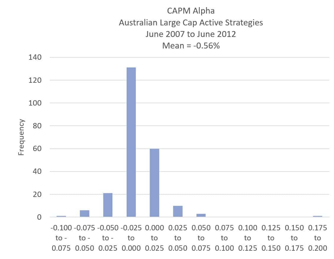
The opening analysis is over five years, starting from June 30, 2007. Chart 1 shows that most of these Active strategies had negative alpha (CAPM alpha). Again, there has been outflow in many active strategies and the disappointment in past performance is somewhat understandable. Despite an outlier with extremely positive alpha of more than 17 per cent a year, the average alpha of the 233 strategies is still negative, at -0.56 per cent a year.
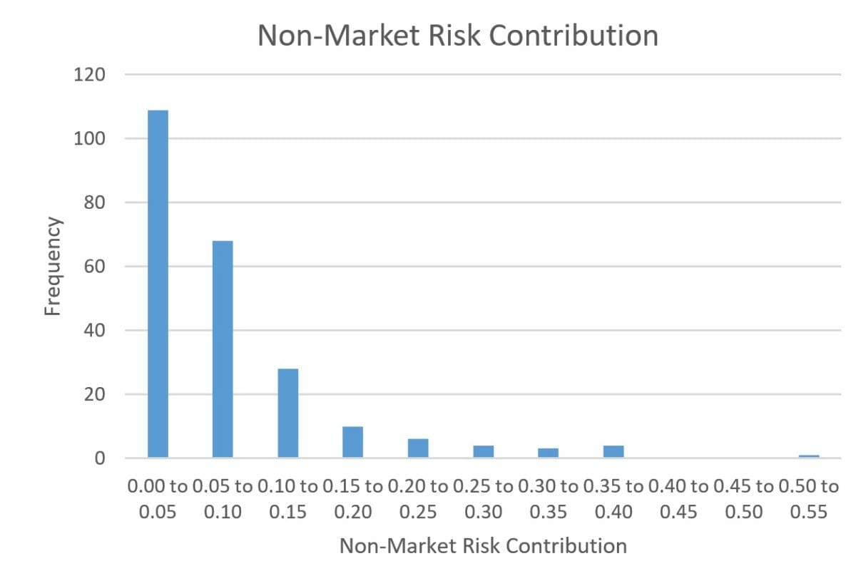
Chart 2 shows the distribution of non-market risk, which serves as a proxy for the degree to which each strategy is active. For the purpose of this article, we assume non-market risk of more than 10 per cent means a strategy is not a benchmark hugger and is a “highly active strategy”. During the five years from June 30, 2007, almost 180 strategies, more than 75 of the total examined, had non-market risk of less than 10 per cent, failing to qualify as highly active by this measure.
Please note, whilst 10 per cent does not appear to be a high number, this cut-off does exclude various concentrated strategies and others that many may regard as highly active. After removing duplicated strategies there are 42 strategies deemed highly active with a track record from June 2007 to June 2017.
Highly active performance results – June 30, 2012 to June 30, 2017
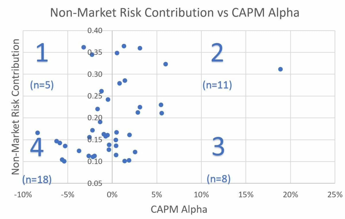
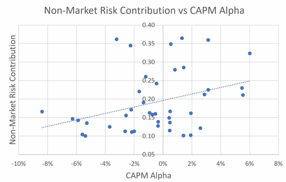
The first issue of interest is whether there is a relationship between the amount of alpha (adjusted for market risk) and the level of non-market risk. Charts 3 and 4 show this relationship (Chart 4 has removed the high performance outlier).
Of the 42 strategies, 19 have positive alpha and 23 are negative. However, there may be a positive relationship between non-market risk and alpha, as most of the negative-alpha strategies are in the 4th quadrant, which has the lowest level of non-market risk (less than 20 per cent). Chart 4 shows a trend line that also supports this potential relationship between higher alpha and high non-market risk.
Drilling down, of the 16 strategies with non-market risk greater than 20 per cent, most (11) produced positive Alpha, suggesting a better alpha for the strategies with higher non-market risk. But these signs but not necessarily conclusive, due to small sample size.
Another look at the 2007-12 data shows that for the most highly active strategies (non-market risk greater than 10 per cent), the strongest alpha has appeared for those with non-market risk of greater than 20 per cent, whilst the weakest alpha is with those with less than 10 per cent. But drawing conclusions from this would be naive, as that would be backward testing and, you could easily argue, data-mining, as it is obviously after the fact. Of more importance is whether there is persistence of alpha for the highly active strategy.
Highly active performance results –June 30, 2012 to June 30, 2017
Chart 5 shows the same relationship between non-market risk and CAPM Alpha as Charts 3 and 4, except this time, the performance is for the following five years (June 2012 to June 2017). Please note, the label for each data point corresponds to its original quadrant position from Chart 3. For example, the highly active positive alpha strategies from 2007 to 2012 are labelled “2”. Also, please note, of the original 233 strategies, about 55 per cent produced positive alpha over the five years to June 2017, so it was a good period for active managers, on average.
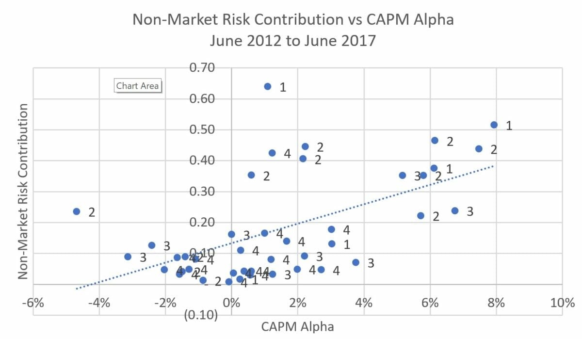
It’s worth noting that the relationship between non-market risk and CAPM alpha appears to have held, as the trendline in Chart 5 slopes upwards. That is, a higher non-market risk appears correlated with higher CAPM alpha.
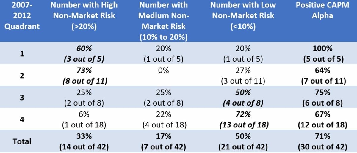
What appears different is there are changes to each strategy’s respective level of non-market risk and alpha. These are summarised in Table 1.
Whilst most of the highly active strategies (30 out of 42) have produced positive CAPM alpha, half (21 out of 42) of the strategies have decreased their non-market risk to what is regarded as low levels (i.e., non-market risk less than 10 per cent), that is, they have become more benchmark-like. Although most (17 out of 21) of these benchmark-like strategies came from the original Quadrants 3 and 4.
Of the highly active strategies from 2007 to 2012 (Quadrants 1 and 2), most (11 out of 16) continued to be highly active from 2012 to 2017. However, whilst their non-market risk appears to have persisted, their performance levels did not. Quadrant 1 consisted of 5 strategies with negative CAPM alpha from 2007 to 2012 and all five strategies produced positive CAPM alpha from 2012 to 2017 – a complete turnaround. The least successful performers (as a proportion) came from Quadrant 2 (the highly active, strong performers) which were the best performers from 2007 to 2012. Whilst most of Quadrant 2’s strategies produced positive CAPM alpha, statistically it was no better than any other quadrant of active strategies in terms of the number with positive CAPM alpha.
Conclusion
The usual practice for investment advisers is to recommend strategies that have shown strong recent performance, which usually comes in the form of positive CAPM alpha. As mentioned in this article’s opening paragraph, since the GFC, there has been a trend towards recommending the more highly active strategy, as opposed to what is commonly referred to as benchmark huggers. What this article’s analysis of data spanning from 2007 to 2017 has shown is that, whilst there appears to be positive aAlpha potential when investing away from the benchmark (high non-market risk), there is no guarantee this relationship persists if focusing only on strong past performers.
Whilst there were a handful of highly active strategies that produced relatively poor performance (negative CAPM Alpha) from 2007 to 2012, with the benefit of hindsight, rejecting them based on this past performance alone was possibly the wrong thing to do. A contrarian approach may have been beneficial, but of more importance would be understanding the drivers of success or failure and deciding whether those drivers are worthy of capturing in the future.
Overall, there are positive signs if looking to outperform benchmarks by recommending highly active Australian equity strategies and maybe using non-market risk of more than 20 per cent is a worthy filter. However, that old cliché that past performance does not equal future performance continues to hold up, and deeper performance analysis will always be required.


Leave a Comment
You must be logged in to post a comment.