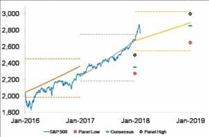
Before a drop of almost 5 per cent yesterday, the S&P 500 showed unusually low volatility in 2017, and returns were very strong. Chart 1 below is one I regularly update and submit to Professional Planner. It shows my equity-market forecasts, based on broker forecasts of dividends and earnings (the solid, thick coloured lines) surveyed by Thomson Reuters.
My forecasts for the high and low of each year are shown with coloured dotted lines and are based on stochastic simulations using volatility assumptions. The Consensus, Panel High and Panel Low are forecasts made at the beginning of each year by various institutions and published on the Yahoo Finance website.
As it turned out, Woodhall’s 2017 forecast was all but spot on, and different from the Yahoo panel’s. In the previous year, Woodhall’s forecast for the end of the year was reasonable, given the substantial sell-off at the beginning of 2016. Buying opportunities presented where the index touched or fell below the lower brown dotted line.
For 2018, Woodhall’s forecast happens to be broadly in line with consensus. When the market ran hard in January, it deviated from the forecast line by more than at any time during 2017. But the market has to breach 3030 (the upper yellow dotted line) for this strategy to suggest a sell signal.
It would take a passive investor not to have considered taking some profits in January 2018; however, the strategy illustrated in Chart 1 does contain appropriate information to enact such a move. Rather, I turn to a measure of mispricing, or exuberance, I calculate from divergence between the actual index and a weighted average of past monthly updates of the index forecast. The notion is that the forecasts are credible, so that if a market runs faster than the projection, it is getting ahead of itself – or overpriced. I show the history of this mispricing signal in Chart 2, dating back to when I commenced calculating it at the start of 2010.
The solid black line is fair pricing derived from an analysis of past forecasts. The blue line is a daily updated index of exuberance. Past values are not revised. The red dotted line is the signal for a correction of 6 per cent to 10 per cent, or a prolonged sideways movement. The trigger value of 6 per cent overpricing was derived from an analysis of similar measures of mispricing for the ASX 200 and its 11 sectors over the period 2003-06.
It can be noted that, prior to 2018, exuberance hit the trigger at two points: in early 2011 and early 2013. The S&P 500 did not stay overpriced for long but there were no serious corrections. Rather, the fundamental (or fair pricing) rose, in part, to erode the overpricing.
Exuberance is not a trading signal. I choose not to buy when overpricing is material – say above 3 per cent – and I might consider taking some profits at 6 per cent if a rebalancing of my portfolio is deemed warranted for other reasons.
So when the S&P 500 became 6 per cent overpriced in the last week of January, I certainly considered taking some profits. This opinion was reinforced when exuberance reached 8.4 per cent on Australia Day.
The market has since corrected a little, but I strongly believe the rally will continue, longer term – not only because of the information in Chart 1, but also because analysts are still factoring in the impact of Trump’s tax cuts, a $US1.5 trillion infrastructure program is now on the table, and volatility is still at or below average levels.
My exchange-traded fund strategy on the S&P 500 and the ASX 200 is long term in nature, so I can ride these waves. Had I taken profits in January, I would have needed a signal to get back in or lose future opportunities for making a profit. While 2550 is the buy signal from Chart 1, that is far away from current levels. And if 2550 is breached in 2018, I can buy back in, using the profits I took last year and wrote about in an article published in Professional Planner.
I believe it healthy to continually consider rethinking one’s strategy but long-term plans should remain just that.
Chart 1: Results and forecasts for S&P 500

Chart 2: Mispricing (exuberance) for the S&P 500


Leave a Comment
You must be logged in to post a comment.